I spoke at a local meetup recently about Responsive Web Design and I'll repurpose the content here as a blog post.
The Problem
In 2007, Steve gave us the iPhone
The success and popularity of the iPhone was incredible. Many companies wanted their website to look good on the device. "Okay," said the web developers, "we will build another website that's optimized for the iPhone, but it'll cost you extra."
Fast forward now to the present: today there are hundreds of different consumer smart phones and tablets. They all have different shapes and sizes, different screen resolutions and aspect ratios, and are meant to be held at different orientations. It no longer makes sense to design a website specifically for a device anymore - there are too many of them.
What are we going to do?
We take inspiration from Mr. Bruce Lee.
Be formless and shapeless like water. When you put it in a phone, it becomes the phone, when you put it in a tablet, it becomes the tablet, when you put it in a window, it becomes the window.
Seeing Is Believing
Seeing is believing. Here I showcase a couple of websites that do this really well. The layout of these sites will actually change as you resize your browser window, so you can see what they would look like at different screen resolutions.
WebDesignerWall.com
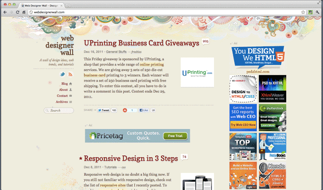
Web Designer Wall switches between 3 different layouts as you change the screen resolution: 1-column, 2-column and 3-column. So no matter what your screen size, you'll have a nice viewing experience(and no scrolling!).
CSS-Tricks.com
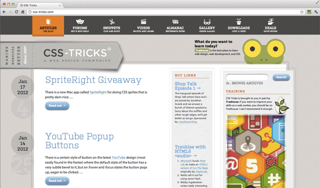
CSS Tricks is an even more dynamic website - it's like the Bruce Lee of websites! I leave it as an exercise for the reader to find all the layout changes and fun easter eggs hidden in this website.
How'd They Do That?
What techniques did they use to achieve these dynamic and fluid websites?
Technique 1: Meta Viewport Tag
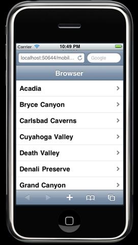
The first thing that you have to do is something called the meta viewport tag. By default, iOS and Android browsers try to render your page as if it were designed for the desktop. It does so by pretending it has a view port of 980px wide in the case of iOS and 800px wide in the case of Android. So when you open the web page initially it'll be zoomed out like this
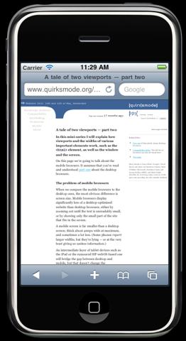
and you can't read the text so the first thing you do is you double tap to zoom in.
This is a bad nice user experience, so we have to fix that. The fix is to put this in your <head>
<code><meta name="viewport"
    content="width=device-width"></code>
This sets the viewport size to the real size of the device. Don't worry, this tag has no effect on desktop browsers.
Technique 2: Fluid Layout
Fluid Layout means that your content grows and shrinks with the size of the window. You achieve that effect by using percentage widths.
#content{
    float: left;
    width: 80%;
}

#sidebar{
    float: right;
    width: 20%;
}
This example is a simple two column layout where the content takes up 80% of the horizontal space and the side bar takes up 20%.
The two boxes will stretch or shrink to take up all the available space. The limitation of this approach is that for smaller screens - such as those for mobile phones - the 2 column layout is still going to be really cramped. Which brings us to the 3rd technique: media queries.
Technique 3: Media Queries
Media queries allow you to have conditional CSS rules that target screen sizes of a specific range.
@media screen and (max-width: 640px) {
    #content{
        float: none;
        width: 100%;
    }

    #sidebar{
        /* just make sidebar go on top */
        float: none;
        width: 100%;
    }
}
This code says any browser with a display width of 640 pixels or less will apply these two CSS rules. The purpose of the two rules here is to override the 2-column layout CSS rules and make a one-column layout instead.
If you open up the demo and play with changing the window size(if you are on IE, make sure you are on version 9 or above), you will see that the layout changes when you cross the 640-pixel width boundary. Note that I also added some extra CSS so that the navigation also switches from vertical to horizontal in the one-column layout.
Media Queries on <link>
Media queries can also be declared on the link tag, so that you can have conditionally linked css files as well. If you prefer to roll like that.
<link rel="stylesheet"
    media="screen and (max-width: 640px)"
    href="small.css" />
Browser Support
While percentage widths have been around forever and work on all browsers, media queries are still relatively new.
Mobile Support
Here's what the support landscape looks like for mobile OS'es
- iOS
- Android
- WebOS
- Opera Mini
- Newer Blackberry
- Windows Phone
Windows Phone is the only OS that still doesn't support - more on that later.
Desktop Support
On the desktop, media queries are supported on the latest version of all major browsers.
- IE 9+
- Firefox 3.5+
- Chrome 4.0+
- Safari 4.0+
- Opera 9.5+
But of course due to the slow adoption rate of newer IE versions, some of us still have to worry about
- IE 8 and below
caniuse.com has more detailed browser support info.
Workarounds for Older Browsers
What to do for older browsers that don't support media queries?
Sensible Fallback
Often times, simply having a sensible fallback is good enough. The older browsers will simply ignore the rules declared inside of media queries, and if you make sure it will be usable despite of that, it is often enough.
IE Conditional Comments
IE conditional comments is another option, specifically for older IEs. For Windows
Phone in particular, it seems the current best practice is to use IE conditional comments
to specifically target IEMobile
<![if !IEMobile]>
<link rel="stylesheet"
    href="windowsphone.css">
<![endif]>
Which: Microsoft, get with the program :)
Javascript Fallback
Yet another option is to employ a Javascript-based solution that emulates the media query functionality. A good one is Respond.js, where you just include the script, and boom! Media queries will start working in all the older browsers.
Images and Videos
Now, let's switch gears to images and videos. Here are a couple of problems images and videos pose when used in fluid and responsive layouts
- they doesn't look good when it has a different width than the rest of the content
- when the width is small, part of the image or video is occluded
The first stab at a solution to this is to stretch the image to 100% width so it fits perfectly to its parent container
#content img{
    width: 100%;
}
But this could cause a lower resolution to scale all the way up and look blurry. So instead
I like to use max-width in addition to centering it.
#content img{
    max-width: 100%;
}
Fluid Third Party Videos
For the <video> tag, you can use the same max-width technique, but most people don't use <video>, it's too hard. Instead people tend more to use third-party video services like YouTube and Vimeo. When you embed a video from these video services, the video is encased inside of an <iframe>.
The problem is, if you give the <iframe> a percentage width, it will mess up its aspect ratio, which could in turn screw up the video's aspect ratio. To fix this problem, there is FitVids.js. Using FitVids.js is as simple as
<script src="path/to/jquery.min.js"></script>
<script src="path/to/jquery.fitvids.js"></script>
<script>
  $(document).ready(function(){
    // Target your .container, .wrapper, .post, etc.
    $("#thing-with-videos").fitVids();
  });
</script>
Here is the result.
Banner Texts
Lastly, there is banner texts. Sometimes you want to make your text really really big so as to maximize its impact. But big text for a large screen could go complete off-screen for small screens, and a big text for a small screen won't be so big for large screens. FitText.js can help you with that. It will size the text size of a banner depending on the size of the display.
References and Resources
- The original responsive design article by Ethan Marcotte
- The book
- HTML5 Please recommends using media queries
- Beginners Guide from Think Vitamin
- Super Showcase from Designmode